Cfplot: turning off bilinear interpolation for rotated grid

Hi Andy:
Thanks.
About the better-named “Zero data plotting” issue: Yes, I agree that plotting below zero as purple and 0.0 to 299.999999 as dark blue is perhaps more reasonable than plotting 0.0 as purple and 0.00000001 to 300.0 as dark blue. But maybe this is configurable by the user? And maybe it would be better to have both the standard cfplot.con( ) and the blockfill_fast=True version of cfplot.con( ) have the same behavior?

About the CORDEX data issue: I can already make a contour plot of the CORDEX data with cfplot without extracting the longitudes and without blockfill_fast. But when I try to use your technique to extract the longitudes to do it with blockfill_fast, then I get the index out of bounds error.
Patrick

Hi Patrick,
Yes, I agree. I will look at the Matplotlib contourf routine and see if there is some option in there that will help. I’m heading off on holiday now and will be back Monday 31st.

Hi Andy:
Did you get a chance to think about this?
Patrick

Hi Patrick,
I’m looking at it but nothing to report yet.
Cheers
Andy

Hi Patrick,
The data projection is oblique mercator and isn’t in a format that Cartopy supports yet. Sadie’s done some detective work and it should be supported in the next release of cartopy. Sadie is also working on projections in cf-python so there will be two avenues to explore in the near future.

In the meantime we need to do a manual plot as cf-plot only accepts 1D lons and lats for coordinates when plotting blockfill.


import cf, cfplot as cfp, numpy as np
import cartopy.crs as ccrs
import matplotlib.patches as mpatches

g = cf.read('pmg2.nc')[0]

lons = g.coord('auxiliarycoordinate1').array
lats = g.coord('auxiliarycoordinate0').array
data = g.array

levs = [0, 300, 600, 900, 1200, 1500, 1800, 2100, 2400, 2700, 3000, 3300, 3600, 3900, 4200, 4500, 4800, 5100]
levs_arr = np.array([-100, 0, 300, 600, 900, 1200, 1500, 1800, 2100, 2400, 2700, 3000, 3300, 3600, 3900, 4200, 4500, 4800, 5100])


cfp.gopen()

cfp.levs(manual=levs, extend='both')

# Make a contour plot with alpha=0 so that the colour bar is plotted
cfp.con(g, alpha=0.0)

nx = np.shape(lons)[1]
ny = np.shape(lons)[0]

for ix in np.arange(nx - 1):
    for iy in np.arange(ny - 1):
    
        # Calculate the local size difference and set the square points
        xdiff = (lons[iy, ix+1] - lons[iy, ix]) / 2
        ydiff = (lats[iy+1, ix] - lats[iy, ix]) / 2        
        xpts = [lons[iy,ix]-xdiff, lons[iy,ix]+xdiff, lons[iy,ix]+xdiff, lons[iy,ix]-xdiff, lons[iy,ix]-xdiff]
        ypts = [lats[iy,ix]-ydiff, lats[iy,ix]-ydiff, lats[iy,ix]+ydiff, lats[iy,ix]+ydiff, lats[iy,ix]-ydiff]
        
        val = data[iy, ix]
        
        try:
            colour_index = np.max(np.where(val > levs_arr))
        except:
            colour_index = 0
        
        
        # Plot the square
        cfp.plotvars.mymap.add_patch(mpatches.Polygon(\
                    [[xpts[0], ypts[0]], [xpts[1],ypts[1]], [xpts[2], ypts[2]],  [xpts[3],ypts[3]], [xpts[4], ypts[4]]],\
                    facecolor=cfp.plotvars.cs[colour_index], transform=ccrs.PlateCarree()))       


cfp.gclose()

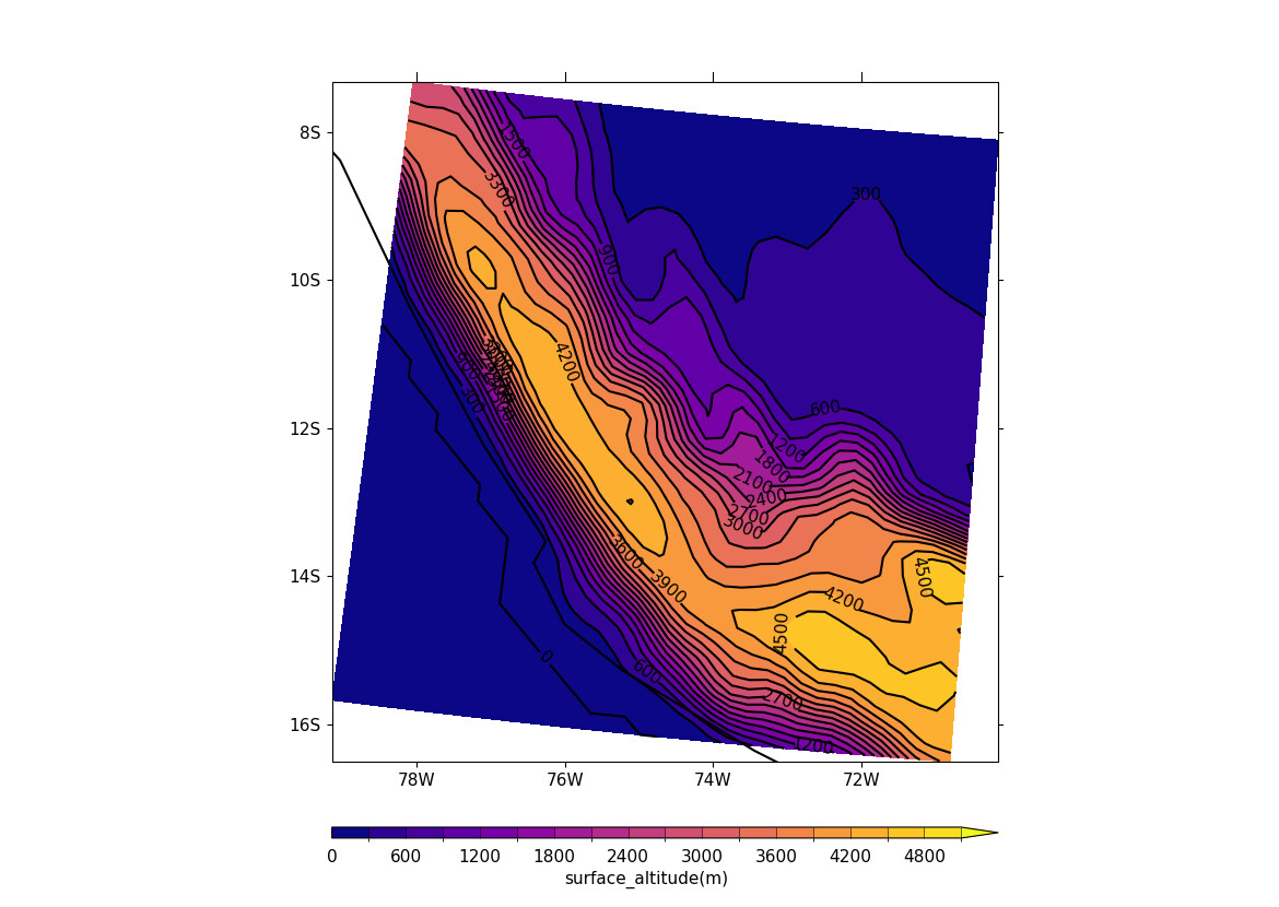
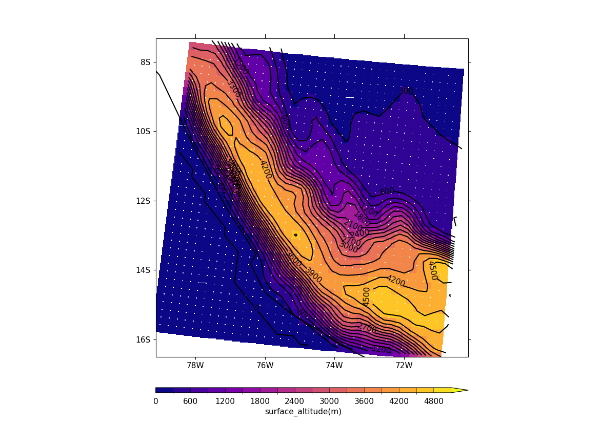
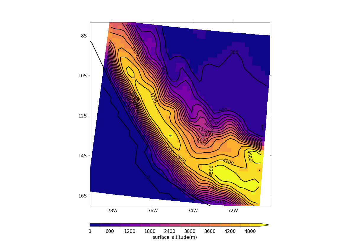
Here’s a plot using cfp.con(g) followed by the blockfill plot made using the code above


.

Thanks, Andy:
That looks a little complicated. But otherwise, it produces a great-looking blockfill plot!
Please do look into the other issue with the color-bar colors when you can.
Much appreciated,
Patrick

Hi again, Andy:
In your last post, the blockfill version of the image had little yellow dots near the corners of the reddish grid cells. Is there a way to get rid of those?
PCM

Hi Patrick,
They are the white background of the plot showing rather than yellow. It looking yellow is an optical illusion but if you click on the picture they are white. So we are plotting the individual squares here rather than a Matplotlib pcolormesh image so that’s why you see white showing through as the corners of the squares don’t all match up. You can change the code slightly to have multiply xdiff and ydiff by say 1.1 and then some of the white patches might disappear. For plotting using pcolormesh we need to wait for the new version of cartopy to be released that supports oblique_mercator.
Cheers
Andy

Hi Andy:
Thanks for the great explanation. I will try your solution soon. How long will it be until the new version of cartopy (that supports oblique mercator) is released?
Patrick

Hi Andy:
It looks like the new version of cartopy with support for oblique_mercator was released 1 month ago:
https://scitools.org.uk/cartopy/docs/latest/whatsnew/v0.22.html

I was able to update my python environment to use the latest version of cf-plot. Did it say that it was version 3.2.21? It doesn’t crash anymore! Thanks!

I attach plots of two South-American regions below, comparing orography for GMTED (used by CHELSA statistical downscaling), CORDEX (which uses dynamical downscaling), CMIP5, and CMIP6.

I made the plotting start at 1 meter elevation, to remove the ambiguity of whether to plot the sea as purple or not. Maybe there is some better convention for this, so that I don’t need to start at 1 meter, and I can start the labels at 0 meters?

Also, the CORDEX plots are using blockfill_fast=True, so I think they are using the new cartopy, with oblique_mercator. But they have the little white dots showing through, so maybe your new cf-plot code is plotting the individual squares?

BTW, I checked the numbers in the NETCDF files for the CMIP5 and CMIP6, which show here a purple square to the east of the Andes, in the Amazon at 10S and 71W. The NETCDF files indeed show negative elevations here. But I don’t really believe the CMIP5 or CMIP6 elevation data there, since the higher-res data for CORDEX and GMTED don’t have these negative elevations there.

My code for the CORDEX is:

data = f.array
lons = f.coord('auxiliarycoordinate1').array
lats = f.coord('auxiliarycoordinate0').array
cfp.con(f=data, x=lons, y=lats, lines=False, titles=False, colorbar=None,
            title=models[iloop], blockfill_fast=True, ptype=1)

Any suggestions?
Thanks for your help in getting the plot to its current state. It is quite a lot better than before!
Patrick

Hi Patrick,

Yes, please use cf-plot 3.2.21.

I was looking at this before I was on leave last week and it’s getting closer. If I do:
levs = [0, 300, 600, 900, 1200, 1500, 1800, 2100, 2400, 2700, 3000, 3300, 3600, 3900, 4200, 4500, 4800, 5100]
cfp.levs(manual=levs, extend=‘max’)

This turns off the less than zero colourbar extension. This makes sense as you don’t have any data below zero in your plot of surface altitude.

cfp.cscale(‘amwg_blueyellowred’)

cfp.con(g) should give the definitive answer:

cfp.con(g, blockfill=True)
The blockfill here matches the contour lines.

cfp.con(g, blockfill_fast=True)
The colour for 4200 and above is too yellow and the blocks for the 300 contour line doesn’t match the
contour line. The whole blockfill plot isn’t quite aligned correctly relative to the contour lines.

So it’s getting closer to what I think is correct. I’m away tomorrow so I’ll look again at this on Friday / next week and hopefully get it sorted.

Thanks, Andy!
This looks great! I appreciate your help here very much.
I will try out some of what you said as soon as I can.
Patrick

Hi Patrick,
cf-plot 3.2.22 and cf-view 3.2.25 are now available on github and pypi. cf-plot 3.2.22 will be available on conda-forge tomorrow. The three plots using fill, blockfill and blockfill_fast now look good to me.

cf-plot 3.2.22 uses the longitude and latitude data to make both the blockfill plots and doesn’t need the 0.22 version of cartopy you mentioned.

Cheers
Andy

Hi Andy:
Many thanks! The plots do look a lot better with cf-plot 3.2.22 and blockfill_fast than before. The little white spots in the CORDEX rotated-grid corners of grid-cells are gone. The plot range on the right side of the CORDEX plot is extended a bit, which might be right. But on the left side of the (unrotated) CMIP6(2015) plot, it appears that there is no data, which might be wrong. I suspect that it might be because the grid-cell centers are not in the plot bounds, but it’s hard to say. See below.
The 2nd plot is the old plot and the 1st plot is the new plot.

The CMIP6(2015) dataset is year=2015 from ~/for_andyh/orog_Emon_UKESM1-0-LL_historical_r10i1p1f2_gn_195001-201412.nc

Patrick

New plot


Old plot

Hi Patrick,
cf-plot 3.2.23 should resolve this issue. I had an idea to speed up plotting of higher resolution map data but it turns out not to have been such a great idea after all.

cf-plot 3.2.23 is available on github and pypi but not yet on conda-forge.

I would change your levels though to be
cfp.levs(0, 5100, 300, extend=‘max’)

Cheers
Andy

Thanks, Andy:
cf-plot 3.2.23 does indeed fix the issue with the missing data on the left side of the CMIP6(2015) plot. See below. It’s too bad that your idea for a speed-up for plotting higher-res data didn’t pan out.

Thanks for the suggestion for changing the range and extend settings for the levels, but I think the setting of min=1 (meter) is better than having the settings of both min=0 (meters) and extend='max'. To the east of the Andes, for example, the purple grid cell has negative elevation for some reason in both the CMIP5 and CMIP6(2015) datasets. Also, I think it is better to have the extend='min' enabled with a min=1 (meter), so that we know exactly when there is a 0 meter elevation. You can see the plot when I use your suggested settings below under the min=0 (meters) and extend='max' plot. That plot has purple showing for everything less than 300 meters, which shows large regions of the Amazon area to the east of the Andes as being less than 300 meters. It also shows the coastline matching the CORDEX blue contour edge, which probably isn’t indicative of the probable mismatch of the <1 meter CORDEX elevation blue edge with the coastline in the top plot.

New plot with cf-plot 3.2.23

Previous version of the plot with cf-plot 3.2.22

Plot with min=0 (meters) and extend='max' (with cf-plot 3.2.23)

This topic was automatically closed 30 days after the last reply. New replies are no longer allowed.